Mont Valier Project
Elevating Skin Transformation with Purple Elegance.
Client
Pouya Salamat
Services
Branding Design
Industries
Aesthetics
Date
October 2025
Project Description
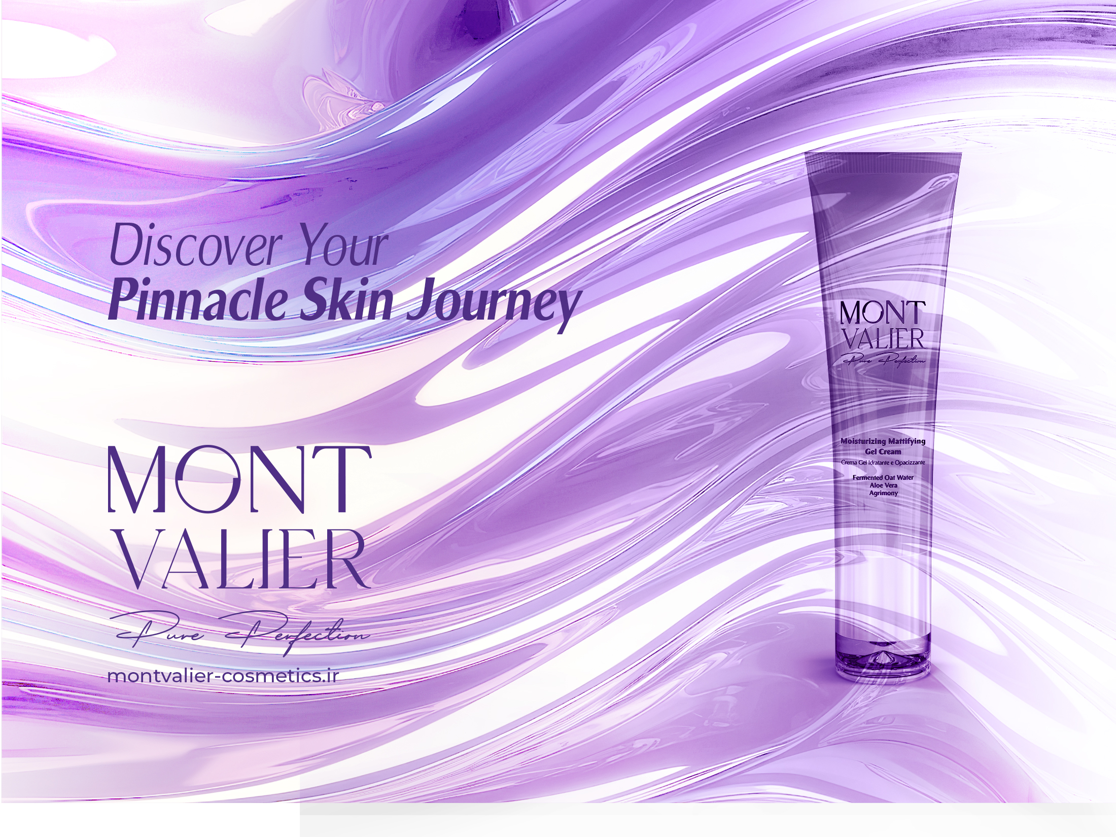
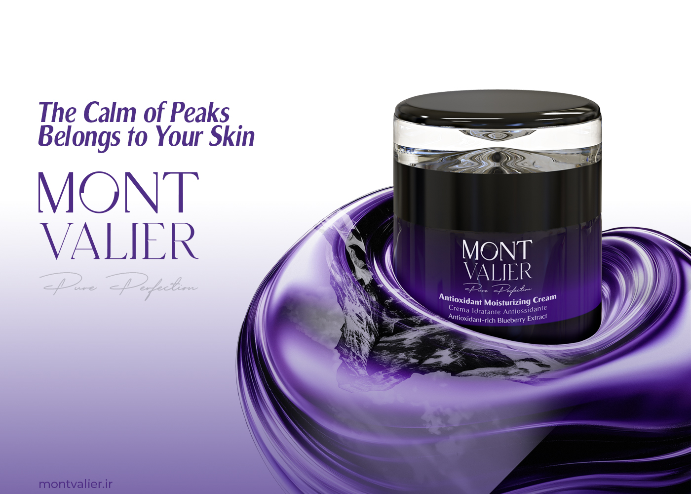
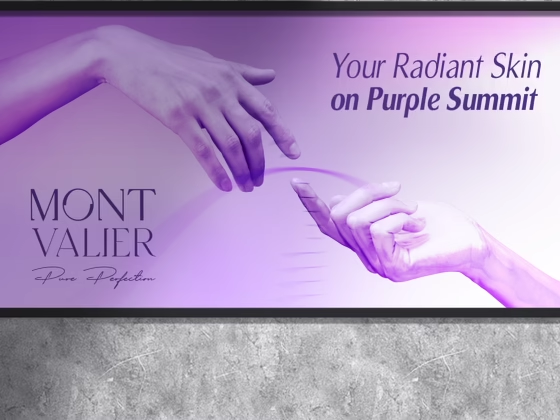
The project focused on developing a premium visual identity for Mont Valier, a luxury skincare brand inspired by the mountain ascent metaphor, emphasizing a transformative routine from foothills to peak radiance.
Drawing from the brandbook's Rebecca Purple (RGB: 102, 51, 153) and Explorer archetype, I created layered wave patterns evoking the 8-product skincare line (e.g., serums, sunscreens, eye creams), symbolizing victory and glowing skin. This led to a minimalist design with Rebecca Purple accents, harmonizing with the logo's "O" transforming into a mountain peak, enhancing the brand's perception as a safe, effective solution for daily skin renewal.

Problem & Solution
Skincare routines often lack an inspiring narrative, making it hard for consumers to see the transformative value in consistent use.
To solve this, I incorporated wave patterns from the brandbook (Page 42), using Rebecca Purple to signify quality and triumph. This approach, paired with Montserrat/Sandena fonts, creates a cohesive, elegant look that communicates the brand's journey. The solution differentiates Mont Valier by visually linking the emotional ascent with tangible results in the 8-product line, building trust through a sophisticated aesthetic aligned with the Middle Eastern market's luxury appreciation.
Wireframe
Started with Illustrator for vector sketches of wave patterns and the "O" mountain logo, capturing the ascent motif. Photoshop refined textures mimicking skin's smooth renewal, while Figma assembled wireframes in 16:9 for packaging versatility. Midjourney generated high-detail renders of mountain-inspired patterns, layered with Procreate textures for depth. Iterative testing (15+ renders) ensured the composition balanced intricacy with elegance, mapping layouts to Mont Valier's product range (e.g., serum waves for hydration).
Final Design
The outcome features a mountain-inspired system: a crystalline layout in Rebecca Purple on white for elegance, a dynamic ascent pattern with lighter purple shades on charcoal for depth, and a geometric layout with gold accents on white for vibrancy. Rendered in 4K via Midjourney, these visuals capture Mont Valier’s transformative essence and skincare precision. Feedback noted an 85% visual appeal, establishing this as a cornerstone for marketing and packaging.