The Reformery Project
Crafting a Cohesive Luxury Aesthetic Brand Identity.
Client
Reformery Aesthetic Clinic
Services
Brand Book Design / Visual Identity Guidelines
Industries
Luxury Aesthetics & Beauty
Date
December 2025
Project Description
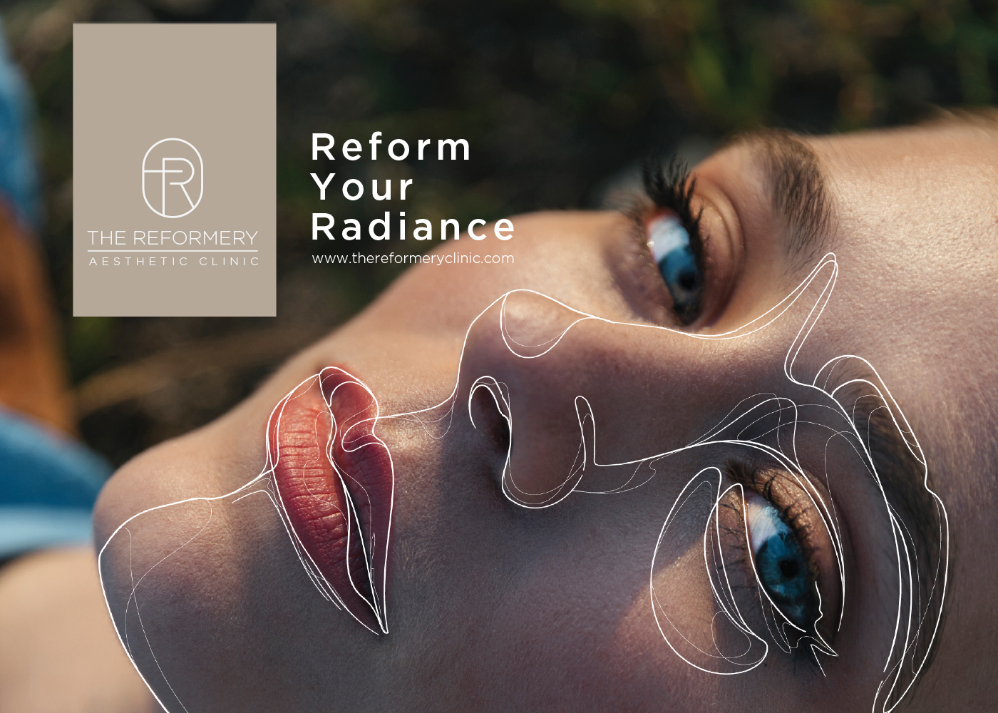
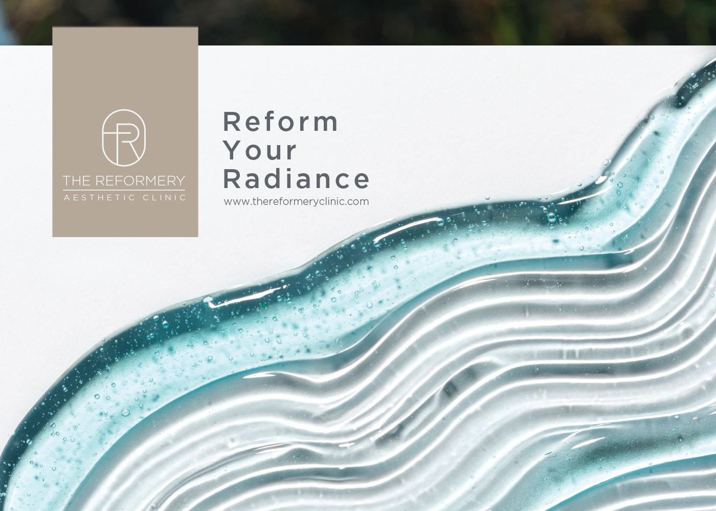
The project aimed to create a comprehensive 90-page visual guideline for Reformery, a luxury aesthetic clinic dedicated to transforming beauty through expert care and premium products.
I developed a complete brand system that ensures consistency across all applications for Middle Eastern and global markets. Using a sophisticated flowing line motif as the core visual thread, the brand book unifies logo usage, color palettes, typography, photography style, and design treatments into one clear and elegant framework.


Problem & Solution
The challenge was that Reformery lacked a unified visual language. Different teams and partners were using inconsistent fonts, colors, and layouts, which diluted the premium perception and created confusion across marketing materials, packaging, and digital platforms.
To solve this, I created a modular and scalable brand book anchored by a single flowing line motif that appears throughout the entire document. This motif acts as a visual connector, ensuring instant brand recognition while allowing flexibility for different applications. The result is a professional, easy-to-use guideline that maintains the sophisticated and luxurious identity of Reformery across all touchpoints.
Wireframe
I began with Illustrator to create the master flowing line motif and establish the grid system. Photoshop was used to test texture variations and color applications on different backgrounds. Figma was then used to build the full 90-page layout with a strict 12-column grid and consistent spacing. The structure includes fixed header zones with the line motif, clear content areas with generous white space, and footer continuation of the flowing line. Multiple iterations were tested for both print and digital readability.
Final Design
The final 90-page brand book features a minimalist cover with the signature flowing line motif in metallic silver on matte white. It includes a complete visual system: primary and secondary color palettes (Greige and Davy’s Gray as core colors), Gotham typography family, detailed logo usage with protected areas, photography guidelines, design treatments, and real-world applications such as business cards, envelopes, and advertising examples. The entire document was designed in Adobe Illustrator and exported as a high-resolution PDF, providing a luxurious yet practical tool for maintaining brand consistency.